0

Embroidery

Embroidery placement for healthcare uniforms

Where your branding sits matters. We help you choose an embroidery position that works with your logo, garment and overall uniform presentation.

1,000+

Healthcare organisations

60,000+

Garments supplied

40+

Years experience

95%+

Client reorder rate

5.0 Google Rating

Most common

Left chest is the standard starting point.

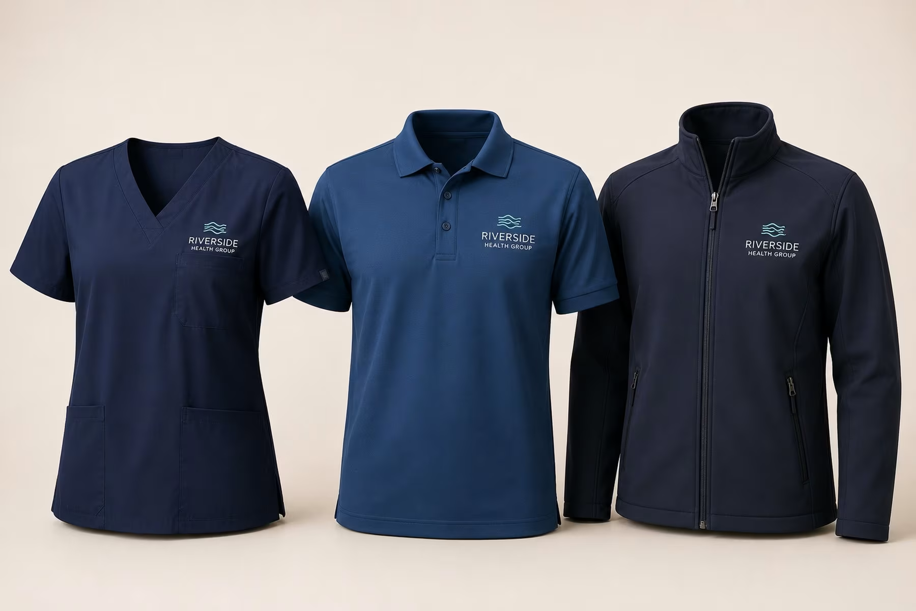
For most healthcare uniforms, left chest is the position people expect to find a logo. It sits in natural eye line, it works comfortably with many polos, shirts, tunics, scrubs and jackets, and it keeps branding present without dominating the garment.

Placement options

The right position depends on what you’re branding.

1
Left chest
Most common

The primary organisational logo position, and the one to start from unless the garment or artwork suggests otherwise.

2
Right chest

Commonly used for a staff name, a role, a secondary identifier, or as an alternative logo position where garment construction requires it.

3
Sleeve

Useful for secondary branding, a department or program mark, or a restrained additional identifier.

4
Collar / nape

A subtle secondary branding position on garments whose construction suits it.

5
Upper back

An option where a larger or more visible organisational identifier is required. It suits some healthcare garments better than others.

6
Lower / hem area

A discreet secondary position, again depending on how the garment is constructed.

1
2
3
4
5
6

Garment type

The garment changes the available embroidery area.

The same logo doesn’t meet the same conditions on every style, so the position is worth confirming against the garments you’re ordering rather than assuming it.

Scrub tops

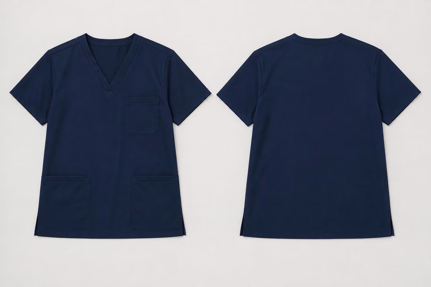
The chest pocket and the neckline set the usable area, so the exact position is confirmed against the specific style.

Tunics

Asymmetric fronts, wrap closures and contrast panels move the usable chest area, often further out than on a straight-front garment.

Polos

Left chest is the usual starting point on most polos, and they carry secondary branding well — sleeve and nape are both straightforward.

Shirts & blouses

A chest pocket, the placket and the button spacing compete for the same area, so the logo is positioned around them.

Jackets & softshells

A centre zip splits the front, so chest branding sits to one side of it, and panelled or lined construction affects how much area is usable.

Knitwear

Knitted fabric has more give than a woven scrub or shirt, so how the garment is constructed matters as much as where the logo sits.

What affects placement

The logo and the garment have to work together.

Placement can’t always be chosen independently of the artwork. A logo might be wide, tall, compact or circular; it might be a symbol with a wordmark, or a wordmark with a tagline. Those proportions affect how comfortably the mark fits a particular embroidery area.

On the garment side, the features that influence the decision are usually:

Pockets

A chest pocket takes the part of the chest a logo would otherwise sit on, so the position moves up or inboard of it.

Zips

A centre zip splits the front, which rules out anything crossing the middle and pushes branding to one side.

Seams and darts

Embroidery sits poorly across a seam, so the usable area is the flat panel between them.

Contrast panels

A panel edge running through a logo reads as a mistake even when the placement is technically correct.

Necklines

A deep or wrapped neckline changes how high the logo can sit before it looks crowded.

Garment size

The same logo has more room on a size 24 than a size 8, which is why the position is confirmed against the range.

So we look at the logo, the garment, the placement and the embroidery size together.

Logo + name

Logo and staff name should read as one system.

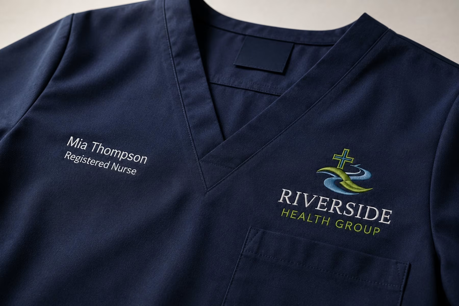
Plenty of healthcare uniforms carry two pieces of information: who the organisation is, and who the person wearing it is. Treated separately they tend to look like two decisions. Treated together they look deliberate.

A common arrangement is the organisation logo at left chest with the employee name, and sometimes a role, at right chest. That is a common approach rather than a universal rule — pockets, garment style, logo shape, how long staff names run, whether role information is included and any other required branding can all point to a different arrangement.

The goal is visual consistency, not an identical measurement.

Across a range we hold the perceived position, the visual scale and the logo’s relationship to the garment’s own features steady, and allow the physical position to shift where a garment requires it.

Uniform consistency

One branding system across different garments.

A single uniform range might run across scrub tops, polos, shirts, tunics, knitwear and jackets. Those garments are built differently, so the embroidery cannot sit at an identical physical coordinate on all of them — and forcing it to would make the range look less consistent, not more.

For a multi-garment or multi-site program, that is the difference between a uniform range that reads as one brand and one that reads as several separate orders.

That judgement comes from doing it at scale — 40+ years, 1,000+ healthcare organisations, and every stitch file built in our own Australian facility rather than sent offshore.

Before production

Placement is confirmed as part of the embroidery setup.

Once we know the garment, the logo and the positions you want, we review how they work together. If a requested position isn’t suitable, or another placement would give a better result, we explain the recommendation first. Nothing goes into production until the embroidery setup has been approved.

Embroidery placement

Embroidery placement FAQs

Left chest. It is the position most people expect to find organisational branding, and it works with most polos, shirts, tunics, scrubs and jackets. It is the starting point unless the garment or the artwork suggests otherwise.

Yes. Tell us the positions you want and we’ll work to them. If a requested position isn’t suitable on a particular garment, or another placement would produce a better result, we’ll explain why before anything is set up.

Not always as an identical measurement. Garments are constructed differently, so the aim across a range is visual consistency — the logo reading in the same place at the same scale — rather than the same coordinate applied blindly to every style.

Yes, and it is a common arrangement — organisation logo at left chest, employee name and sometimes a role at right chest. Pockets, garment style and name length can point to a different arrangement, so we confirm it against your garments.

On suitable garments, yes. Sleeve embroidery can work well for secondary branding or a department mark, while the upper back can provide space for a more visible organisational identifier where required. Whether either position works depends on the garment.

It does. A wide horizontal logo, a tall one and a compact circular mark all occupy a chest area differently, and a wordmark with a tagline needs more room than the symbol alone. We look at the logo, the garment, the placement and the embroidery size together.

Yes. Placement is confirmed as part of the embroidery setup, and nothing goes into production until that setup has been approved.

Size & Fit Guide

×

Avery is cut for a contemporary, slightly tapered fit that flatters without restricting movement. Prefer a relaxed fit or planning to layer? Size up.

Model — Women's5'7", wearing size S
Model — Men's6'1", wearing size L
FitTrue to size, tapered body
LengthHip-length, V-neckline
Chest (CM)Body LengthSleeve
XXS81–865830.5
XS86–916031.5
S91–976232.5
M97–1026433.5
L102–1076634.5
XL107–1146835.5
2XL114–1227036.5
3XL122–1327237.5
4XL132–1427438.5